


 77 / 86

THIS PAGE IS PRINTED ON 115GM TRIPLE COATED SILK ART PAPER
Flaħenin+ Art>ork
When designs are built up using a
number of layers and transparencies,
it is important that they are ‘flattened’
before creating a PDF. Un-flattened
transparencies are notorious for causing
print problems. Flattening your artwork
will ensure that it prints as intended,
without compromising on aesthetics.
Colo<r atchin+
Please ensure that your artwork is produced using CM colours.
This will reduce the number of variables that can affect final colour
output.
Both un-calibrated monitors and un-calibrated desktop printers
are likely to render very different colours to those produced on a
professional printing press. Please ensure your monitor is calibrated
using the steps set out in the ‘Photographs and Graphics’ section.
We have produced two Hard Copy Colour Charts lone is printed on
coated material and the other is printed on uncoated materialm from
which we strongly recommend you make your colour selections.
Each shows over 1000 colours together with their CM values,
each of which are exactly matched to our presses. When a colour
is chosen from the swatch sheets and the CM values selected in
your design, you can be confident that the finished result will closely
match your expectations.
Our Colour Swatch Booklets are available for 15.00 AT {
Carriage each or 25.00 AT for the pair. They are an invaluable
and accurate way of ensuring predictable colour.
If you have a particular colour issue, e.g. a requirement to match to a
specific company colour or previous print /ob, this must be brought
to our attention at the order stage. Simply specify the required
colour match in the ‘Special Instructions’ section during the online
ordering process. If you have a swatch of the colour required, please
send us a hard copy. We cannot be held responsible if your printed
work does not match your requirements unless those requirements
are brought to our attention before we go to print.
PAGE
75
N // ARTWORK
PRE PRINT GUIDE TO ARTWORK
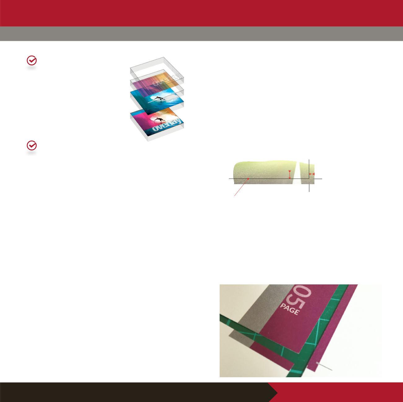
lee& an& <iet or&er
Understanding the need for bleed and a quiet border is vital if we
are going to achieve our /oint aim of an excellent finished print /ob.
Bleed allows for the tolerance of our guillotines lthe machines used
for cuষng your /ob ađer printingm and helps to reduce the margin of
error during finishing. If your image finishes exactly at the edge of
your required finished siAe then these small deviations may produce
unsightly white flashes at the edge of your print. By extending
your background colour or image beyond the edge of your finished
/ob, the effects of the same deviations are not noticeable. We
recommend that elements intended to go to the very edge of your
finished /ob should extend 3mm beyond the edge.
A quiet border is the distance you should allow from the edge
of your finished page siAe for text, diagrams or images not going
to bleed. The reason for the border stems from the tolerance in
cuষng. If you have a design where the text runs to the very edge,
any cuষng deviation will result in some of your text being cut off.
With a very small quiet border, even the smallest cuষng deviation
could result in the finished /ob looking uneven. We recommend
a standard siAed quiet border where any text or necessary design
work ends at least 5mm inside the edge of your pro/ect.
Tri11e& e&+e An@ te?t 9ho<l& #e in9et at lea9t
11 (ro1 the tri11e& e&+e
01234 567890
ian@neffren-logistics.co.ukIan Grahame
Logistics Manager
5mm
3mm
I1a+e9 9ho<l&
#lee& 11
#e@on& the
tri11e& e&+e